How CSS Flexbox model can cause cumulative layout shifts
UX optimization is a tricky aspect of front-end development. You might be surprised, but CSS Flexbox, when misused, can introduce layout shifts in web applications.
Cumulative layout shift, CLS is one of the six Google Core Web Vitals metrics for measuring user experience scores of web applications. Cumulative Layout shift is a user-centric metric that addresses the visual stability of UI elements in a webpage.
When DOM elements in a webpage change positions or dimensions - horizontally, vertically, or in both directions. It can cause visual instability in what looks like the page is jumping or janky and is frowned upon by the end-users.
Sometimes, you might be on the verge of taping a button, link, or image on a webpage, and boom, the button moves down or up, causing you to tap on something else.
Cumulative Layout Shift is a measure of the largest layout shift experienced in a webpage that is not initiated by a user action. The higher the value, the bigger the layout shift happening on the web page.
Cumulative Layout Shift also has performance bottlenecks, as it causes the browser to repaint some part of the page or even the whole page. Because of this, it is crucial to address cumulative layout shift occurrences in a web app as it reduces browser rendering works.
Causes of Cumulative Layout Shift
There are many causes of Layout shifts in a web application. Some are very easy to detect and resolve, while others are not. Below is a list of the causes of Cumulative Layout Shift:
- The display of images, videos, and UI objects without reserved dimensions (without appropriate width and height values)
- The dynamic or asynchronous addition or removal of DOM Elements without a placeholder width and height values
- Dynamic resizing of UI elements without a user action
- Third-party scripts or ad providers insert banners without a reserved placeholder or appropriate dimensioning.
- The use of specific CSS Flexbox properties
- Animating or transitioning CSS properties that cause UI reflows, such as Padding, Margin, Height, Width, Top, Left, etc
This article addresses item number 5. It shows how using certain Flexbox properties can introduce layout shifts if misused.
CSS FlexBox model, what they are
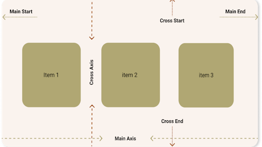
CSS Flexbox is a layout model that allows arranging items along a main axis and a perpendicular axis (cross axis). Flexbox Items can flex (expand) to fill the available space and shrink to fit in a smaller space.
Flexbox items can also be arranged in different ways along the main and cross axis. The beginning of the main axis is called the main start while the end is called the main end. Similarly, the beginning of the cross axis is the cross start, while the end is the cross end.
An illustration of CSS Flexbox model, with the main and cross axis higlighted
A CSS box becomes a flexbox if its display property is set to flex or inline-flex. An Inline Flex Box is a flexbox that behaves in a similar way to inline elements as it can have other elements flow around it.
CSS Flexbox and Layout Shift
Unless if explicitly specified, when web browsers paint flexbox items, it does not know the exact dimension of the items as they have to be computed because of the nature of Flexbox.
Flex Items can shrink or flex (grow) depending on the available space. This is where the problem lies. Browsers draw DOM elements bit by bit in frames. Hence, the accurate dimension of a Flex item is known until all items have been rendered.
Certain flex properties cause Layout Shifts if misused. they include:
- Align-items property which alters the flow of flex items along the cross axis
- Justify-content property, which alters the flow of flex items along the main axis
- Align-self
- flex which causes a flex item to grow based on the leftover space
- Use of Margins to push flex items horizontally or vertically
How Flexbox can cause Layout Shift
Let us look at how the flex properties listed above can cause layout shifts. Imagine if we have a flexbox div with three items whose flex-direction is row.
The flex items will be laid out one after the other in the horizontal direction, as shown in the image below, with no custom spacings or flex specifications:
Illustration of flexbox items laid out in a horizontal direction without a custom arrangement
The layout above will cause no issues, but if we decide to space out the items using justify-content: space-between for instance, it can cause layout shift. This is possible because of how the browser render and paint items on the screen.
If the browser could not paint the three items at once within a given frame, it can cause a layout shift. If the browser is able to paint the first two items in a single frame, it will behave as if there are only two items, hence, the second item will be spaced out to the end.
The browser might not be able to paint the three items within a single frame because of the following reasons:
- The processing/rendering speed of the computer
- The items have long contents, that just takes time to completely render/paint
- Other processes are blocking rendering, such as JavaScript.
On the next frame, the browser will render and paint the third item, but this time, it will adjust the position of the second item, pulling it towards the left to accommodate the 3rd item. This causes a layout shift.
These things can be very subtle and hard for the human eye to spot, but when you run a performance audit on google chrome dev tools with frame capturing enabled, you will see a jump or movement of the second item between frames.
Illustration of layout shift caused by flexbox, item 2 is pulled back to accommodate item 3.
How to Fix Layout Shifts caused by Flexbox Items
The simplest method to fix layout shifts caused by flexbox items is to give the items width values. This will help the browser in decision making. By having specified widths, flexbox items can be positioned appropriately across frames.
The second method is to avoid adding or removing flexbox items later without holding their positions, especially when they are not in the default arrangements due to Justify-content or align-items CSS definitions on the flexbox.
Thirdly, use margin positioning sparingly because of the same reason pointed above. If used, ensure the next or previous items have specified width values to avoid incurring layout shifts.